
After half a year of preparation we launched a new version of our website www.eman.cz at the beginning of March. In addition to a completely new design the web offers above all comfortable browsing on various types of devices such as PCs, tablets and mobile phones.
How the new web www.eman.cz was created
One of the main goals of the launch of our new website was to offer a possibility to browse the web comfortably on various devices, including the mobile ones of course. Mobility is making our living and therefore we would like to provide more information about our applications, better orientation in the website content and new graphics as well.
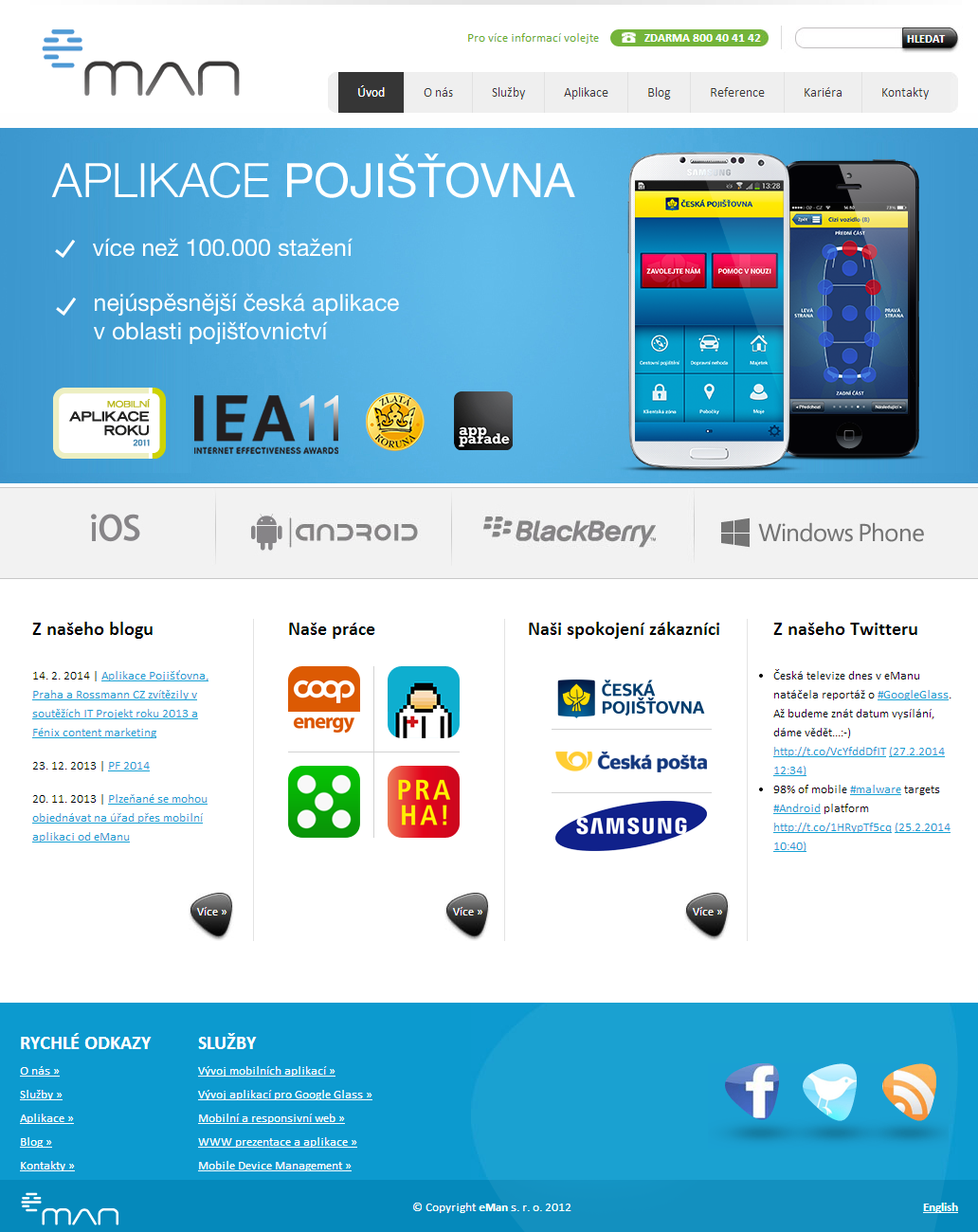
Old web eman.cz (autumn 2010 – 28.2.2014)
Our objectives were clear, therefore we began to work. First of all, using pen and paper, we design rough sketches of selected pages. Our paper consumption was immense, nevertheless the layouts was soon ready on the table. At the end of this phase we had to redraw manually all the sketches to wireframes, which represented the base for graphic design. Wireframes were prepared in UXPin on-line tool, offering a pleasant user intefrace and possibility of creation of wireframes for responsive website. All the wireframes were designed for three different types of devices – mobile phone, tablet and PC.
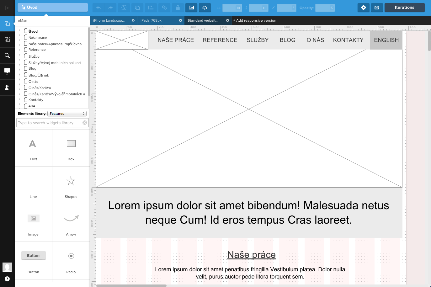
Homepage design in UXPin
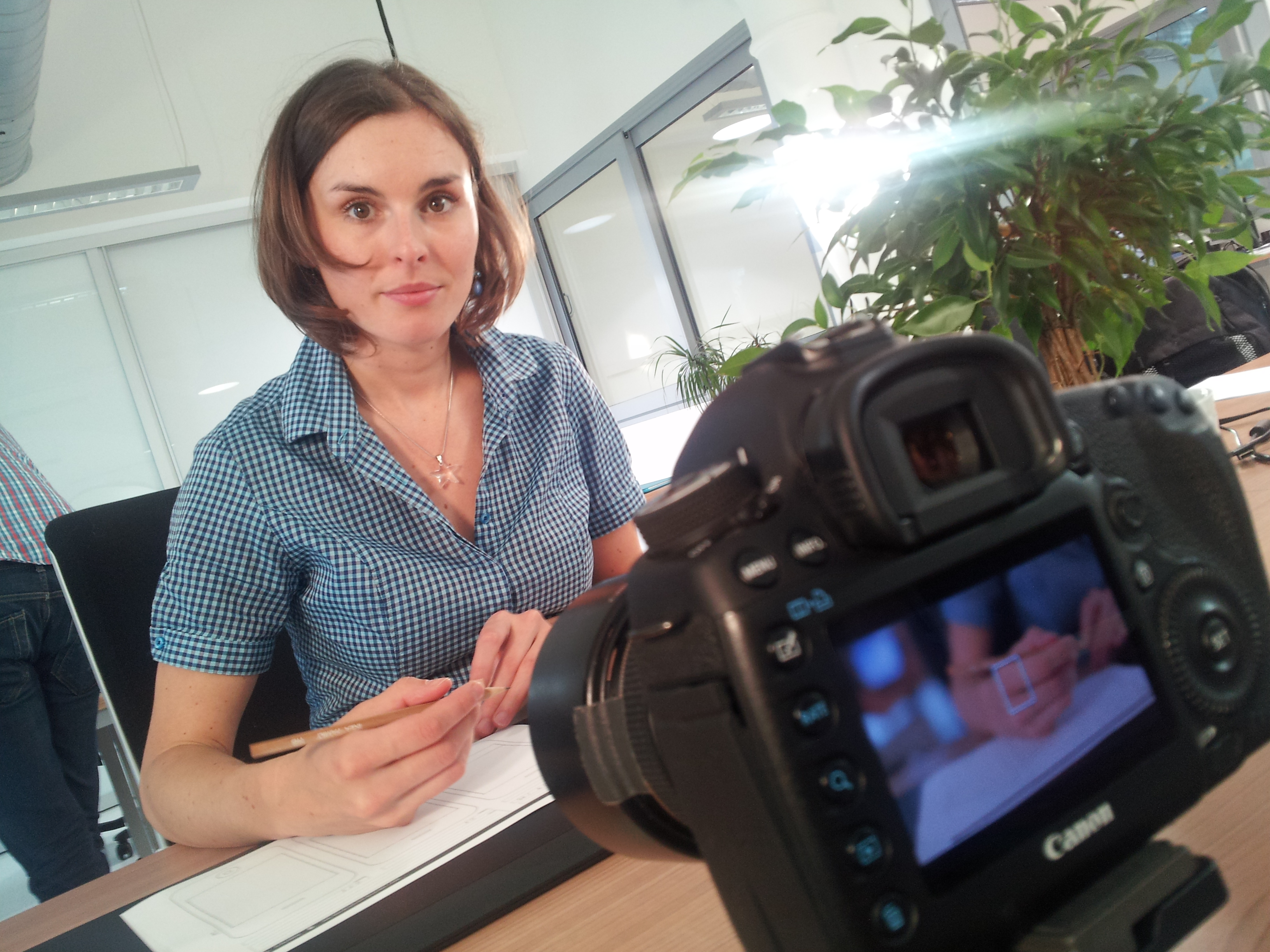
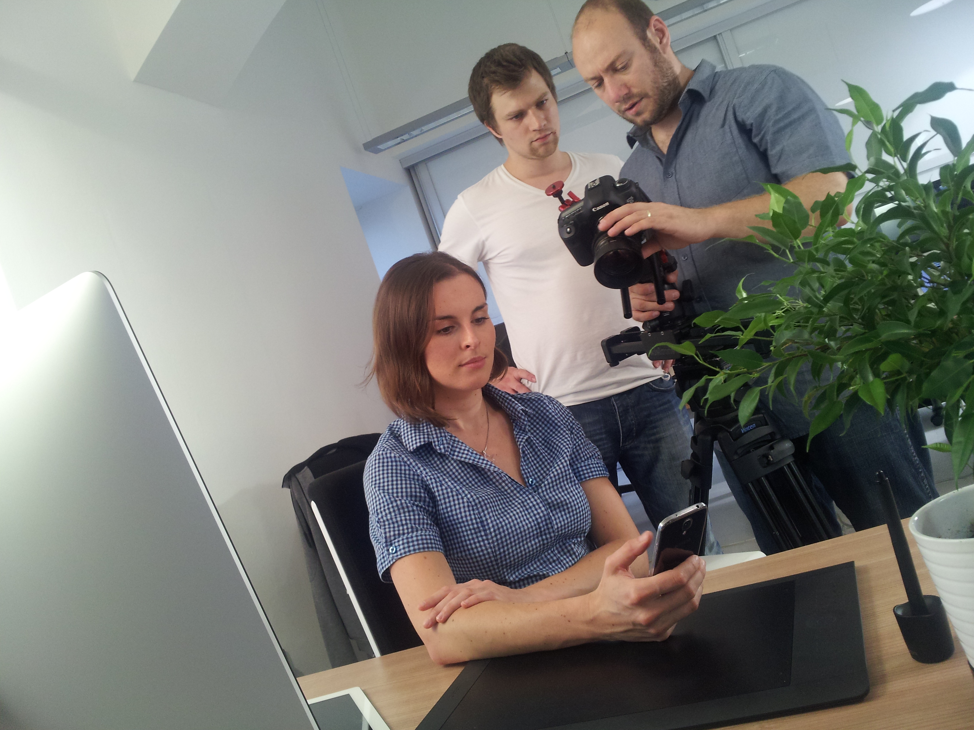
The phase that followed included the preparation of graphic design of particular web pages. We had a clear idea of which parameters should the new web visuals meet. Simplicity and clarity, attention to typography, color recovery compared with the previous website, use of illustrated Eman character as well as of other original pictorial elements… Discovery of each specific route was a living process. The very first graphic proposals engage our attention so much that the decision was finally made. What follows were weeks of demanding work, such as creation and abrasion of graphic proposals of each page including illustrations for all of the three types of devices – mobile phone, tablet and PC.
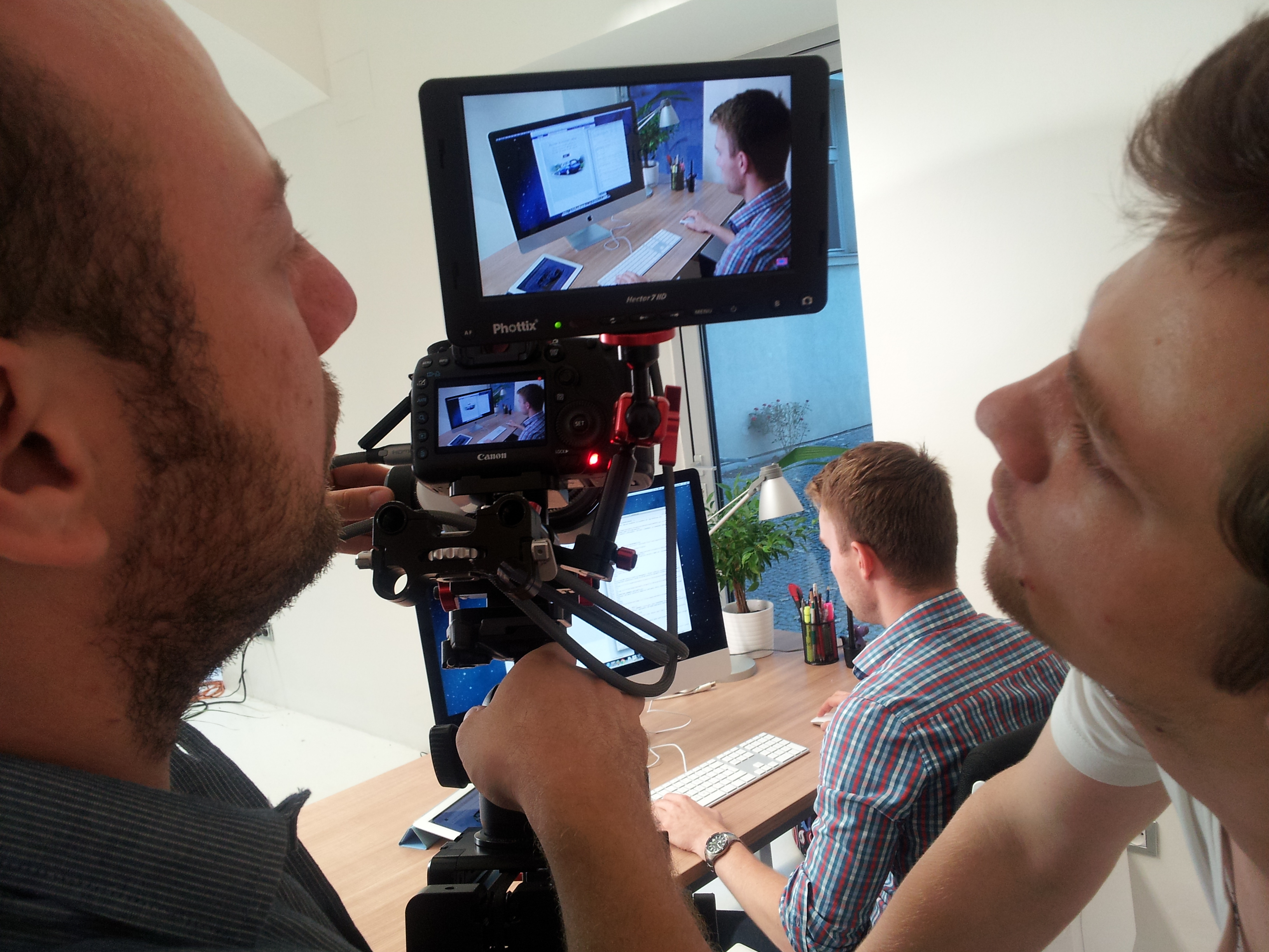
http://youtu.be/rIvH5WbcEc4
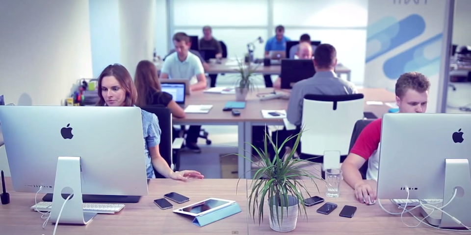
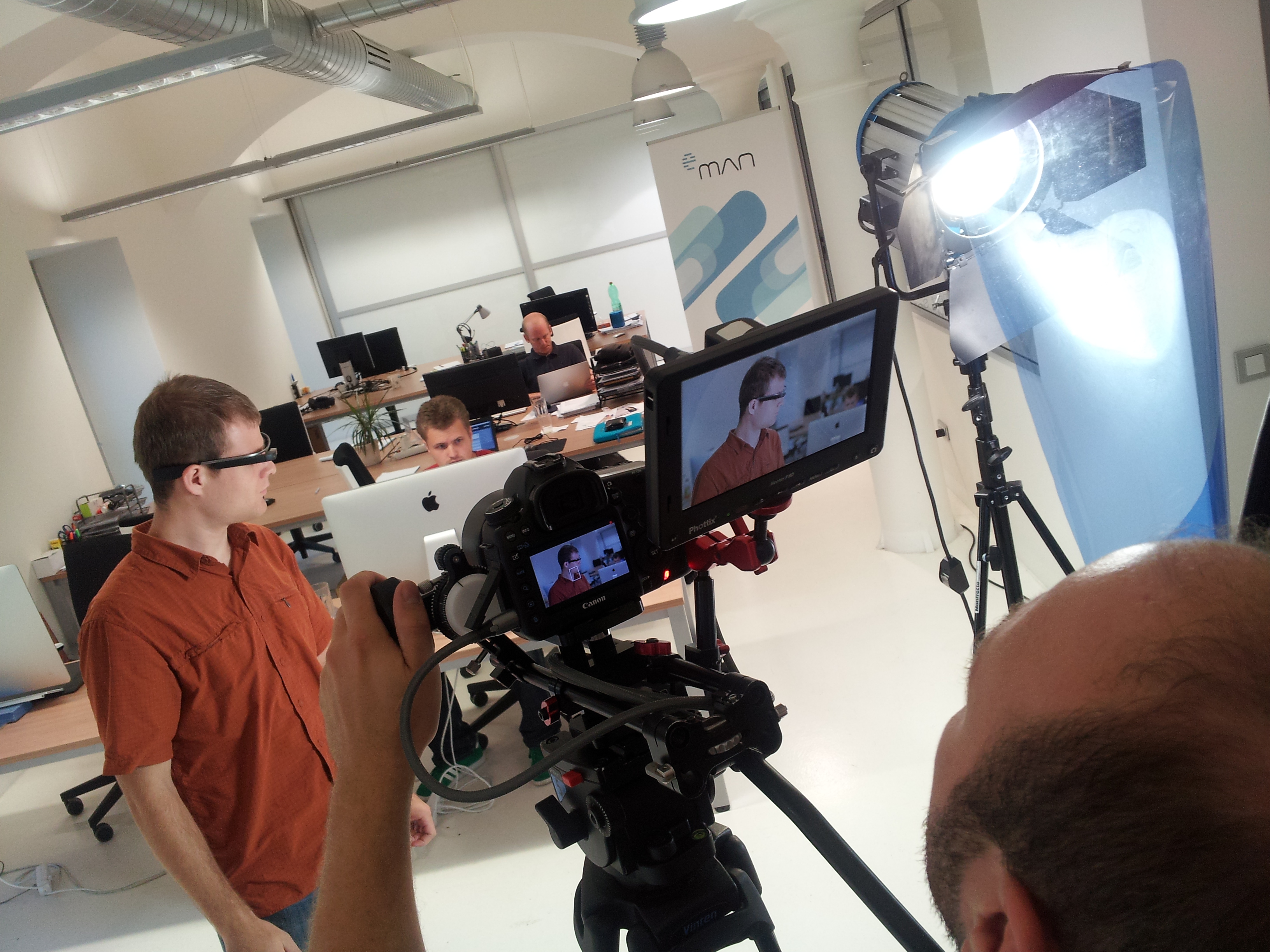
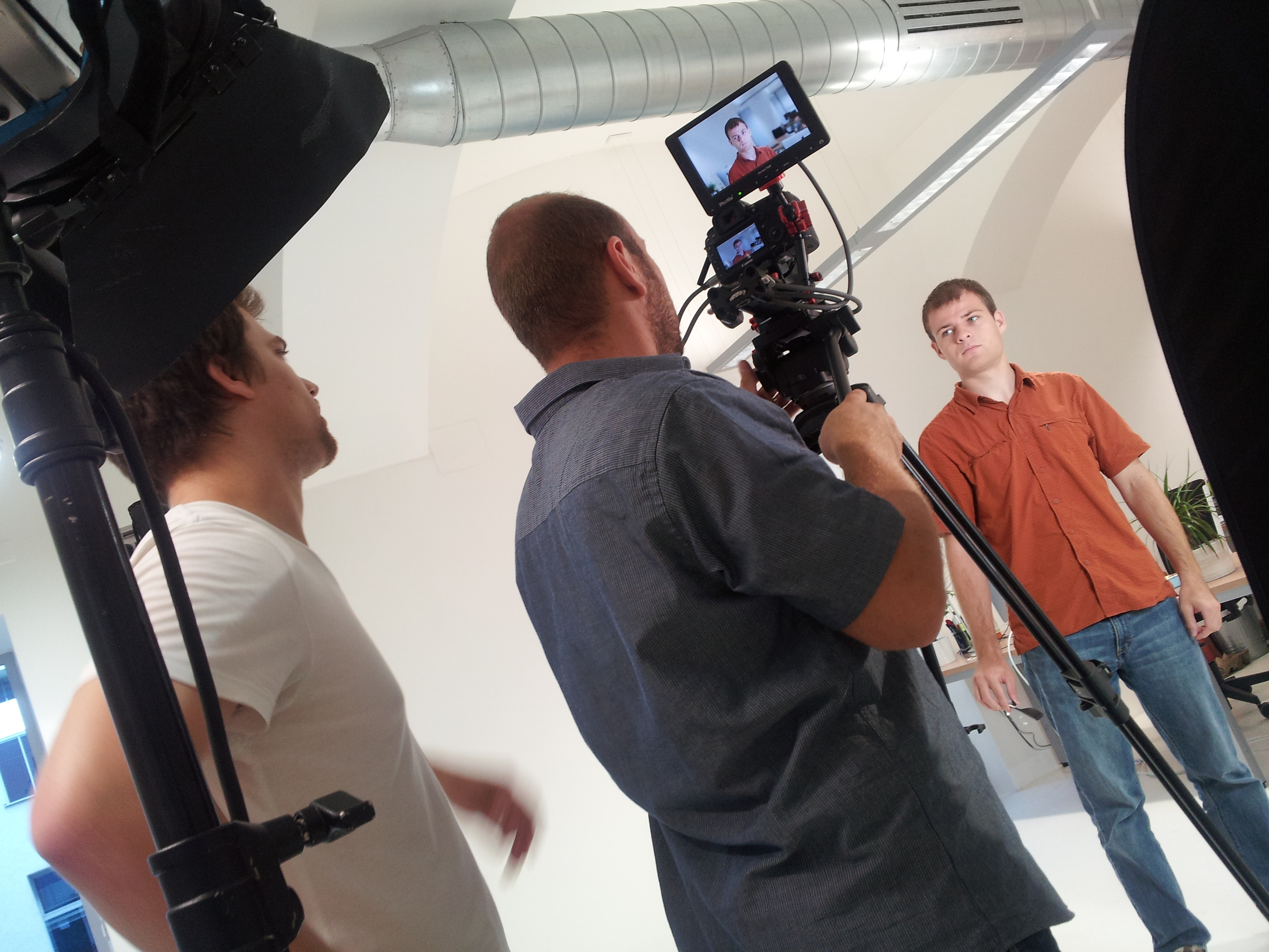
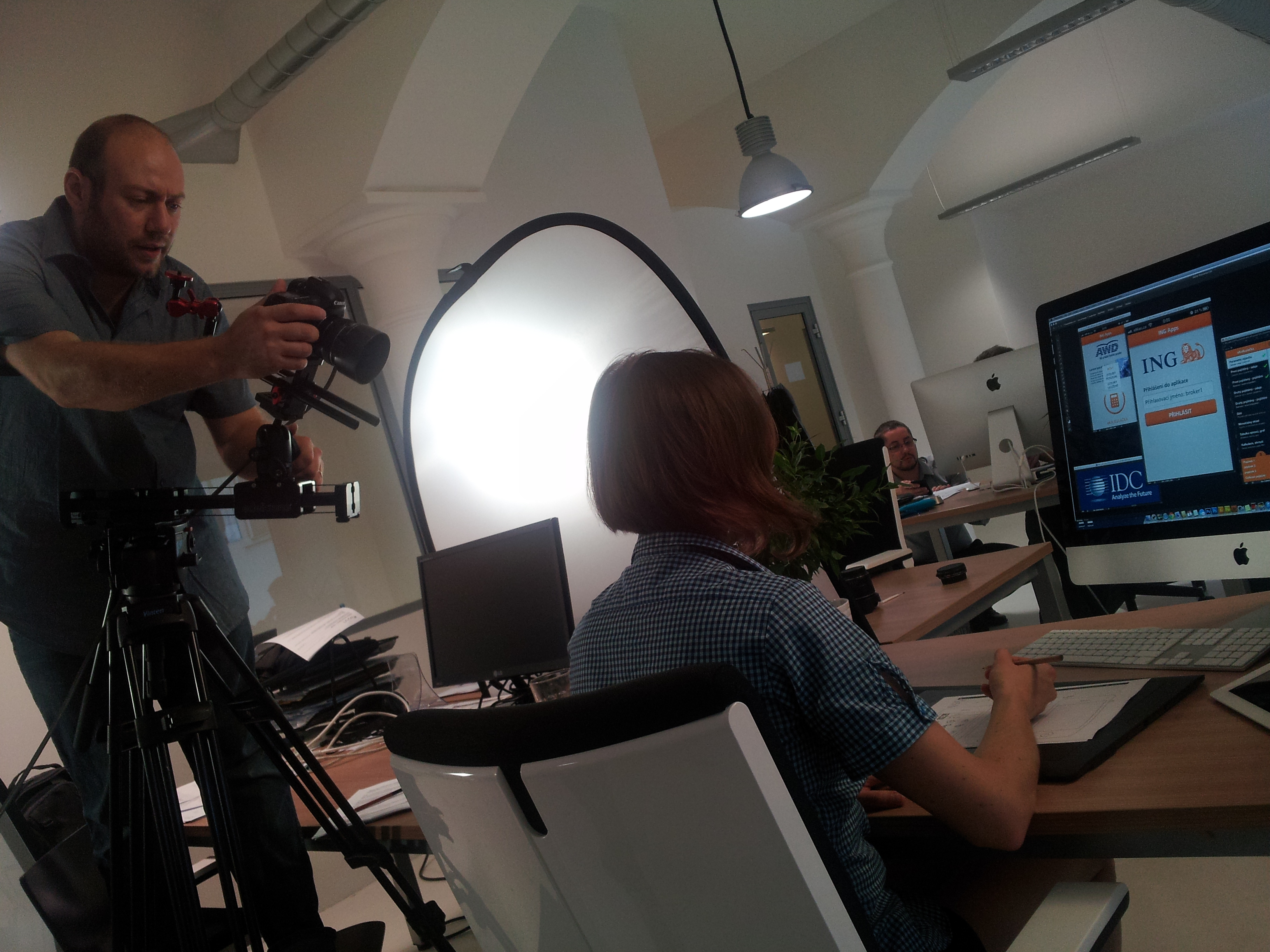
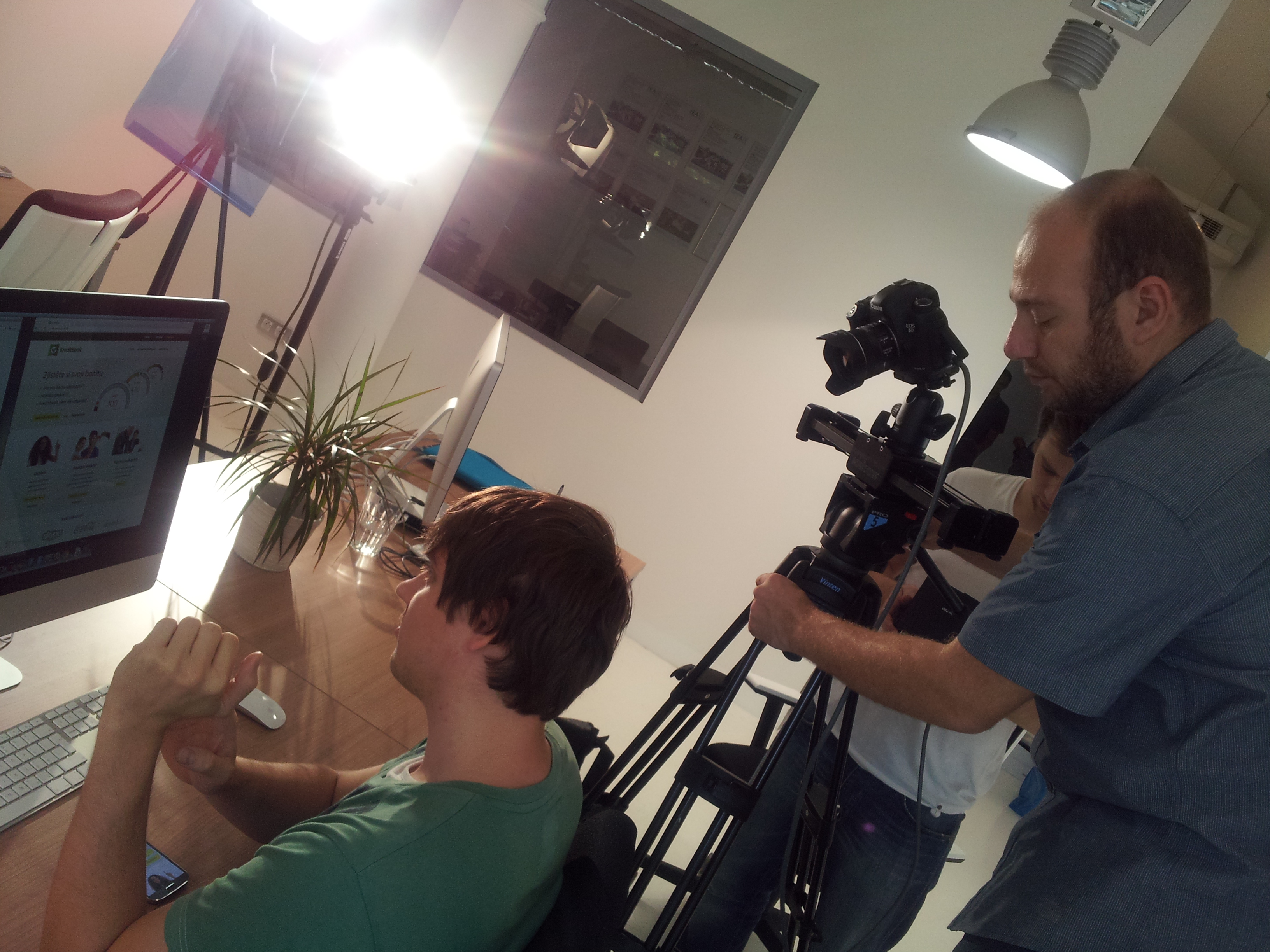
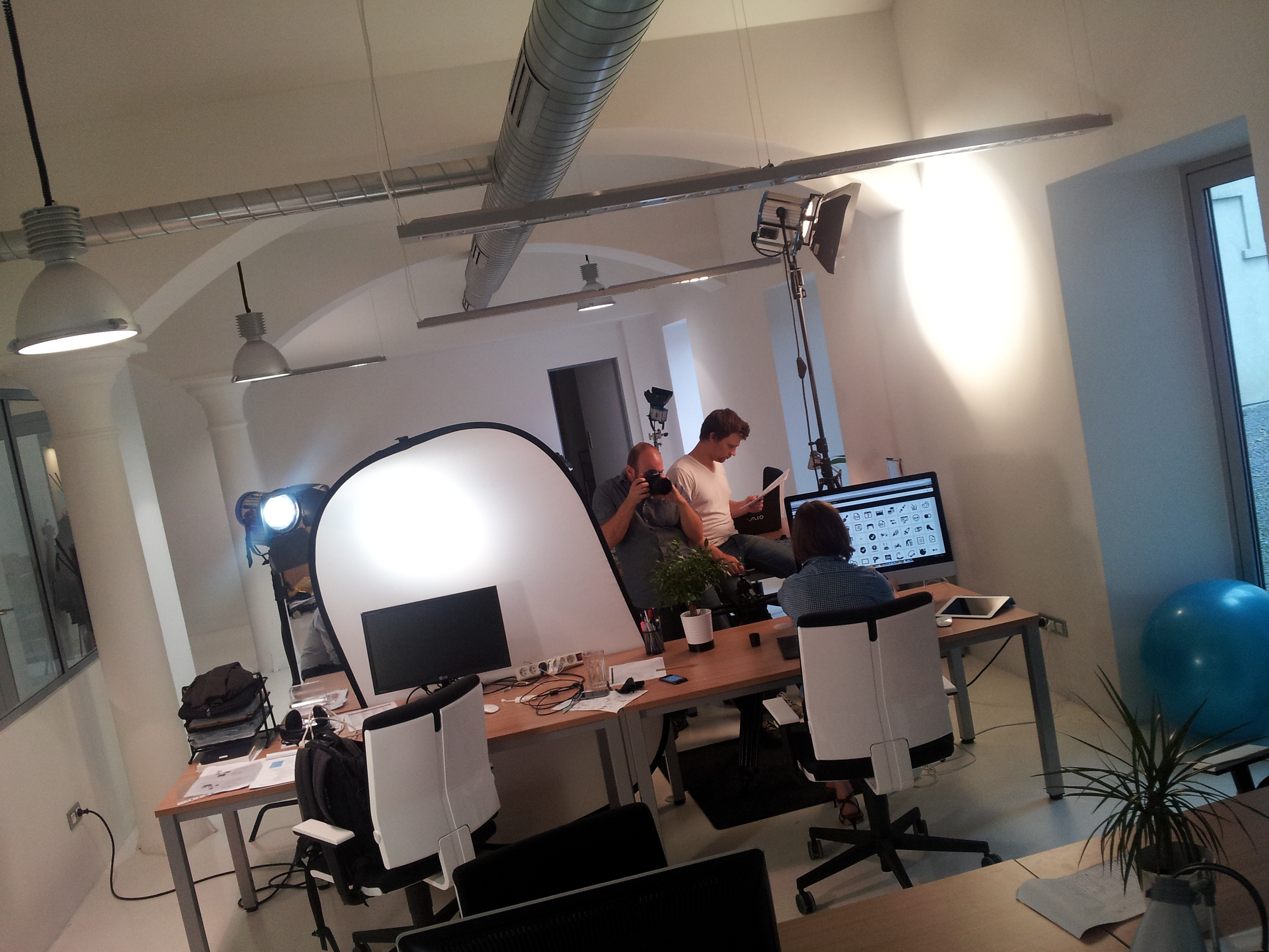
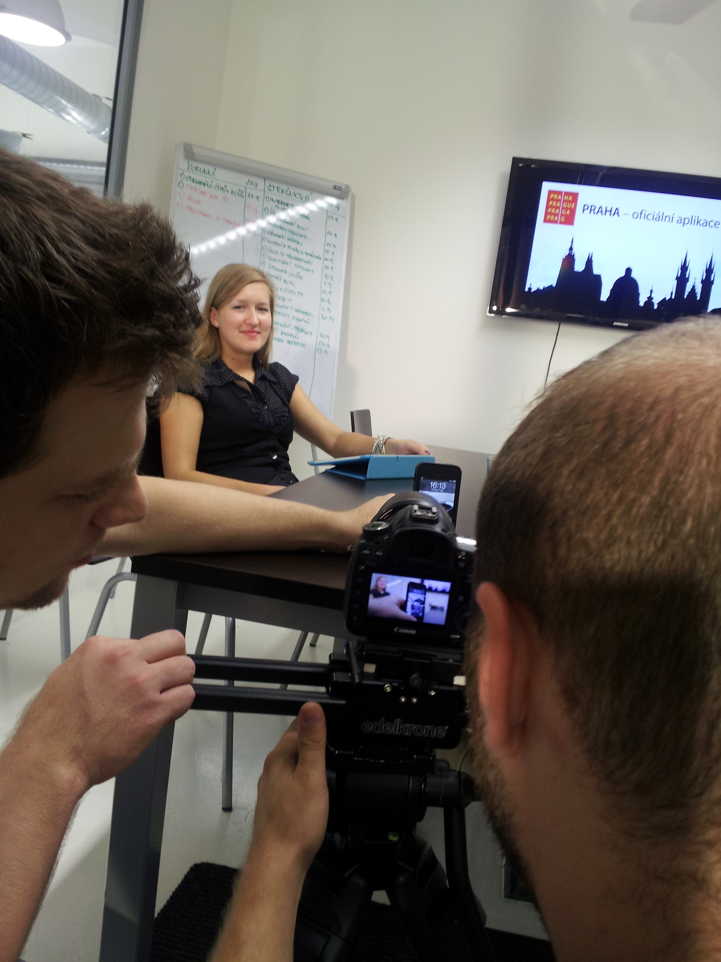
Homepage is like a shop window. It has to catch customer´s attention and lure him to enter. The visitor must indicate at first glance, with whom he is dealing. To further underline the importance of the Eman brand, we decided to place a video on a homepage. The principal aim of the video is to promote the perception of our company as a leading player on the Czech market of mobile solutions development. The video shoot itself took place at the end of summer in our former offices in Korunní dvůr (The Crown Court). Filming of roughly one-minute video lasted for 12 hours. Editing and other post-production work took several weeks.
Choice of the platform on which our new website is run was simple. Again, we chose the WordPress opensource editorial system together with Thesis 2 framework. WordPress accounts for roughly 20 percent of the world internet and it proved to be a good choice for us when creating the former version of the web. Given the amount of specific parameters appearing on our new web, we had to face several month of encoding, debugging and troubleshooting. One of the toughest propositions was tuning of the pages on different mobile devices.
Web is a living and constantly developing organism, therefore we have to continuously develop and improve it. In the near future we will have to tune the content, remove minor bugs and finally launch the English and German language version.
We will gladly read your comments and suggestions for further improvement. Feel free to send them to marketing@eman.cz. Thank you.